-
STATISTICS
STATISTICS
12.1 Graphical Representation of Data
The representation of data by tables has already been discussed. Now let us turn our attention to another representation of data, i.e., the graphical representation. It is well said that one picture is better than a thousand words. Usually comparisons among the individual items are best shown by means of graphs. The representation then becomes easier to understand than the actual data. We shall study the following graphical representations in this section.
(A) Bar graphs
(B) Histograms of uniform width, and of varying widths
(C) Frequency polygons
(A) Bar Graphs In earlier classes, you have already studied and constructed bar graphs. Here we shall discuss them through a more formal approach. Recall that a bar graph is a pictorial representation of data in which usually bars of uniform width are drawn with equal spacing between them on one axis (say, the x-axis), depicting the variable. The values of the variable are shown on the other axis (say, the y-axis) and the heights of the bars depend on the values of the variable.
Example 1 : In a particular section of Class IX, 40 students were asked about the months of their birth and the following graph was prepared for the data so obtained:
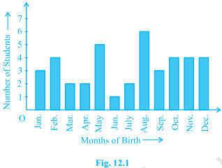
Observe the bar graph given above and answer the following questions:
(i) How many students were born in the month of November?
(ii) In which month were the maximum number of students born?
Solution : Note that the variable here is the ‘month of birth’, and the value of the variable is the ‘Number of students born’.
(i) 4 students were born in the month of November.
(ii) The Maximum number of students were born in the month of August. Let us now recall how a bar graph is constructed by considering the following example.
Example 2 : A family with a monthly income of ` 20,000 had planned the following expenditures per month under various heads:
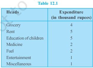
Draw a bar graph for the data above.
Solution : We draw the bar graph of this data in the following steps. Note that the unit in the second column is thousand rupees. So, ‘4’ against ‘grocery’ means `4000.
1. We represent the Heads (variable) on the horizontal axis choosing any scale, since the width of the bar is not important. But for clarity, we take equal widths for all bars and maintain equal gaps in between. Let one Head be represented by one unit.
2. We represent the expenditure (value) on the vertical axis. Since the maximum expenditure is `5000, we can choose the scale as 1 unit = `1000.
3. To represent our first Head, i.e., grocery, we draw a rectangular bar with width 1 unit and height 4 units.
4. Similarly, other Heads are represented leaving a gap of 1 unit in between two consecutive bars. The bar graph is drawn in Fig. 12.2.

Here, you can easily visualise the relative characteristics of the data at a glance, e.g., the expenditure on education is more than double that of medical expenses. Therefore, in some ways it serves as a better representation of data than the tabular form.