-
Data Handling
Data
Data is a collection of information in the form of numerical figures. It can be arranged and displayed in the form of tables, graphs or charts, In the previous classes, we have learn't to represent the data by pictographs, tally charts and bar graphs. Now we will learn about double bar graph and pie chart.
Double Bar Graph
To compare data, we use double bar graphs. The following examples will help us to understand the concept of double bar graphs and the method of drawing them.
Example: Ramya conducted a survey in her class to find out which colours are liked by most of the boys and girls of her class and record the observations as follows:
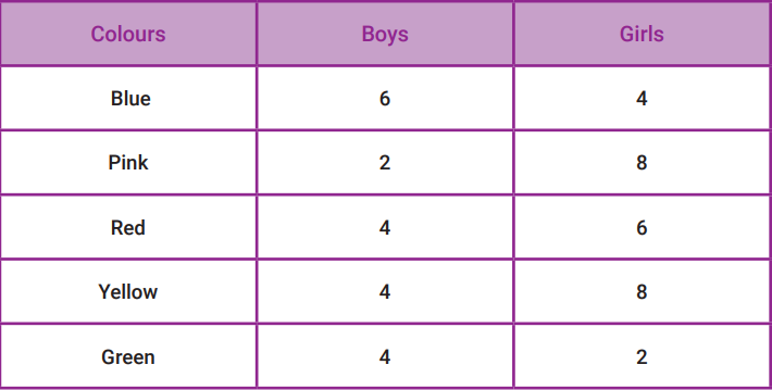
Draw a double bar graph of the above data.
Solution:
Step 1: Draw horizontal and vertical axes. Mark the number of boys and girls on vertical axis.
Mark the colours on horizontal axis.
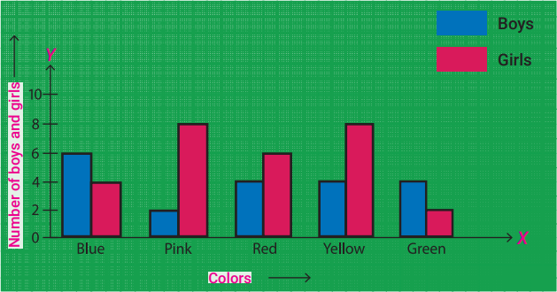
Step 2: Choose an appropriate scale for the vertical axis. Here, 1 cm = 2 children.
Step 3: For each colour, draw one bar for boys and one bar for girls. Make a key to show different colours used for boys and girls bars.
Example: The given graph shows the number of sale of two models of Maruti and Honda vehicles during five months, Look at the graph and answer the following questions:
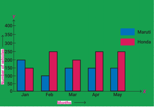
(a) Which model had the highest sale during first three months?
(b) During which month Maruti had the highest sale?
(c) What is the total number of Maruti sold?
(d) What is the total number of vehicles sold during the five months?
Solution:
(a) Sale of Honda vehicles during first three months = 150 + 250 + 200 = 600
Sale of Maruti vehicles during first three months = 200 + 100 + 150 = 450
So, the model of Honda had the highest sale during first three months.
(b) In January, Maruti had the highest sale.
(c) Total number of Maruti sold = 200 + 100 + 150 + 150 + 150 = 750
(d) Total number of vehicles sold during the five months
= 200 + 150 + 100 + 250 + 150 + 200 + 150 + 250 + 150 + 250 = 1850
-
Pie Chart
Pie Chart
Data can also be represented by dividing a circle into sectors, Such representation of data is called a pie chart or circle graph. Pie charts are circular in shapes. Each section of the pie chart shows a fraction of the total amount. It is generally used to compare parts of a whole.
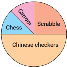
Example:
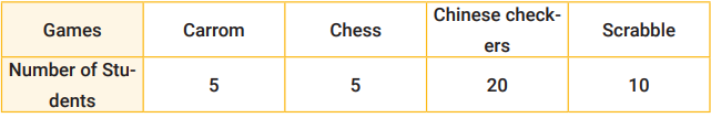
Given below is the data of the games, the students of class V like to play:
Draw a pie chart.
Solution:
Step 1:
Total number of students = 5 + 5 + 20 + 10 = 40
Step 2:
Find the fraction of students that like to play each game.
Carrom = 5 out of 40 =\({5 \over 40}={1 \over 8}\)
Chess = 5 out of 40 =\({5 \over 40}={1 \over 8}\)
Chinese checkers = 20 out of 40=\({20 \over 40}={1 \over 2}\)
Scrabble = 10 out of 40=\({10 \over 40}={1 \over 4}\)
Step 3:
Draw a circle.
Step 4: Fill the circle according to the fractions. The obtained circle is the required pie chart
Example: Study the pie chart which shows the time spent by Rahul at school on different activities and answer the following questions:
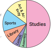
(a) Which activity is given half of the time spent in school?
(b) Which two activities together take one-fourth of the time spent in school?
(c) Which activity takes the minimum time?
(d) If Rahul spends 6 hours in school, how many hours does he study there?
Solution:
(a) Time spent in studies is half of the total time.
(b) Art and craft and sports take one-fourth of the total time.
(c) Assembly takes the minimum time.
(d) Half of 6 hours i.e., 3 hours. So, Rahul studies 3 hours there.